
Thursday, 29 January 2015

Tuesday, 27 January 2015
Feedback
Introduction
This is a mood board that I have created to showcase the feedback I received for the from the first draft of m y teaser trailer. From now on I will use this mood board as a reference for when I continue to produce my trailer and any other task.

Click the image above to be linked to my initial feedback board.
Sunday, 25 January 2015
Sequence one
 Like I had stated earlier in my blog I had began to use adobe after effects to create a film institution intro and some trailer intersections, just like the letterboxing these conventions were placed to increase the authenticity of my teaser trailer.
Emphasizing on the themes of the darker side of technology I had included free stock footage of static to act as an transition between scenes in my teaser, I had also used adobe after effects to create some glitch effects and transitions to better fit the general tech theme of the teaser.
The music that I am using in my teaser trailer is called Oh Death, this was a short track that was created for the US hit TV show Supernatural that was used to introduce the character of death into the shows continuity, I believe that this song is quite fitting for my teaser as the lyrics give an emphasis on death, a key theme that is heavily implied in my teaser trailer.
Friday, 16 January 2015
Turbine Films intro
To further add to the authenticity of my teaser trailer I though it would be quite reasonable to create a pseudo movie institution to publish and distribute my film. Film intuition introductions send to fall into two categories; the cinematic and the indies. The cinematic introductions tend to borrow a lot of conventions from cinematic pictures; this includes motifs like lenses flares and cinematic sound FX whilst on the other hand the indies tend to come across more plain and would often just include some text and or an image whilst in other cases they may replicate motifs of bigger institution intro (an example being Lionsgate Entertainment) ; these motifs add to the overall aesthetics of the indie style.
An example of a cinematic intro
An example of a indie intro
Thursday, 15 January 2015
Monday, 5 January 2015

Designing my logo
Introduction
Horror movie logo all follow different conventions depending on which conventions that the movie follows. Must slasher logos will consists of a red font that creates the effects of blood dripping from the letters whilst others genres such as the psychological horrors feature a logo with an eerie font and and eerie colour to further implement the themes of the movie.
The themes in my narrative consist of; internet relationships, technology, suicidal thoughts thereby dictating that my narrative falls into the somewhat psychological genre, but due to the antagonist in my narrative being a killer; my narrative also falls into the slasher genre.
My initial ideas for a logo will be a bold logo that represents all the themes that occur in my trailer; these themes are suicide, stalking and online networking, I am planning on incorporating this into my film logo by stylizing them into my logo, for example I could have could use a digital font to represent the theme of online networking or incorporate a picture of some hanging themselves on one of my type faces to represent the theme of suicide.
Step one
 Since I had gained previous experience from using it last year on my AS media coursework I will be using Photoshop to design and create my film logo. I had created two separate layers; I had used the first as a sort of backgroup for my text which I placed on the second layer, since the color of my text is white the black backgroup allows me to see the text clearly.
Step two

I then proceeded to change the font of my text to "True lies" which was the font that won the poll of what font I should use in my logo, I also ramped up the spacing between each character because I though the letters were to cramped together.


Horror movie logo all follow different conventions depending on which conventions that the movie follows. Must slasher logos will consists of a red font that creates the effects of blood dripping from the letters whilst others genres such as the psychological horrors feature a logo with an eerie font and and eerie colour to further implement the themes of the movie.
The themes in my narrative consist of; internet relationships, technology, suicidal thoughts thereby dictating that my narrative falls into the somewhat psychological genre, but due to the antagonist in my narrative being a killer; my narrative also falls into the slasher genre.
My initial ideas for a logo will be a bold logo that represents all the themes that occur in my trailer; these themes are suicide, stalking and online networking, I am planning on incorporating this into my film logo by stylizing them into my logo, for example I could have could use a digital font to represent the theme of online networking or incorporate a picture of some hanging themselves on one of my type faces to represent the theme of suicide.
Step one
Step two
I then proceeded to change the font of my text to "True lies" which was the font that won the poll of what font I should use in my logo, I also ramped up the spacing between each character because I though the letters were to cramped together.
Step three
I had then found a stock image of a person hanging themselves and traced it unto of my text layer to give the impression that the victim is hanging themselves from the letter E; this will be the portion of my logo that represents the suicidal themes of my narrative.
Step four
I had shorten the rope used to hang the victim and had move the victim higher.
Step five
To achieve the digital look I was going for in my logo I had merged all the layers together and then duplicated it, after this I had changed the RGB split of the duplicated area and slightly moved it to the right to give a sort of glitch effect on the text.
Step Six
Finally I had found a glitch texture online and had used placed it on a layer on top of the duplicate area and had changed the layer style to and overlay to give it an overlay over the text.
Sunday, 4 January 2015
Finding the right sound for my trailer
Now that I am in the post production portion of my project it is time to start searching for some resources to use when composing my trailer. The first on my list would be to find the right sound for my trailer. In order to add authenticity to my trailer I will be using sites such as freesound.org and YouTube to find sound effects.
Tuesday, 30 December 2014
Photo graphs
When planning a photoshoot it is very important to keep three key areas in mind; number one, your artistic vision; before you rush blindly into taking some photographs and calling it a day it is important to have a visualization of what you want your final product to look like, for me this was easy as I had already began venturing with the visual themes and aesthetics I want for my movie, this visual theme being a very relevant technological/internet theme. Branching off from the artistic vision another key area to keep in mind is you model/characters physicality; it is important to direct your model to move or act in a particular way to accurately portray the state of mind or story that your character would be telling through their body language. Last but not least it is always vital that you have the correct equipment and or setting that you would need to fulfill your artistic vision and too aid your character physicality, this could range from anything such as having the correct props, costume, lighting and etc.
Follow Ochuko's board Photoshoot inspirations on Pinterest.
Above is someone is a pintrest board that I made to give me inspiration for my first photoshoot, I initially wanted to search for some images that focused on the darkside of the web/technology but after a few minutes of exploring I had stumbled across quite a lot of horror themes photography that seemed to be pressing on out of body experiences, dual personalities and demonic possessions, although there are rarely touched upon in my initial narrative I was inspired by them and had decided to tweak my narrative just to incorporate this type of photography into my project, in addition to this, out of body experiences, dual personalities and demonic possession are all very popular horror motifs which would allow my final product to look and feel more authentic.
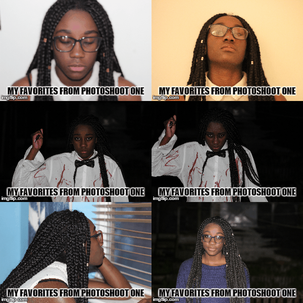
 I had used a Cannon EOS 600d to capture my photographs, the same
Above are some of my favorite photographs from my first photoshoot, I will start of by saying things did not go quite according to plan nevertheless this photographs still came out decent and nothing a little Photoshop can't fix ( haha XD). Let me start of by relating the outcomes to my key features.
Artistic vision
The type of vision I had for this photoshoot was to present my main character in two different physicals states, state one being the state of an everyday teenage girl and state two being the state of a psychopathic turned suicidal killer, I had also planned to have an extra state to showcase my character during her transition of physical states.
Model/Character physicality
This is something that I had heavily focused on during my photoshoot, I wanted my model to tell a story through her body language and this is something that she certainly did. Take the psychopathic photographs for example I had directed her to stand in that particular way and too hold the knife in the particular way in order to evoke some semblance of fear into my audience.
Equipment
I had used a Cannon EOS 600d to capture my photographs, the same
had used to film my footage, in addition to this had used the 50mm 1.8 lenses with the camera as the lenses is a much better fit for recording video and capturing images in low lighting than the default lenses that the camera comes equip with. using some leftover fake blood I had bought for filming my footage and an old white shirt I had fashioned together a DIY killers costume.
Thursday, 18 December 2014
Poster Mockup
Introduction

This is the first draft of my movie poster, this movie poster is reflective of the original movie Suicide club movie poster. I had decided to go with the same colour scheme of the original movie poster, this colour scheme is yellow and black, I added the splash of white/grey to add a little more dynamic to the colour scheme. I added the hashtag to the bottom right of the cover to draw the attention of the viewers to the social network section of the movie posters.
The masthead of the movie poster is slanted because I was applying the technique of the rule of Z into my movie poster. The rule of Z applies to this poster by directing The viewers attention firstly to the slanted masthead of my poster, audience attention is then directed to the reflection of the masthead to further staple the film tittle into their minds, this rule of z then directs the viewers attention to the social links at the bottom left of the poster; to allow the viewers get more information about the film, finally the rule of z directs the viewers attention to the hashtag at the bottom right of the screen.
Sunday, 7 December 2014
Day three of filming
Today I had re shot some of the night scenes I had filmed earlier but came out lest then desirable and I had also filmed the remaining night scenes in my schedule. I had shot all these scenes during the day time, this is because as stated before I do not have any sort of professional lighting to light up my actors when filming in low lighting so I decided to just film all my night scenes during the day and edit the clips to make them look like they were shot at night time in post production.


Saturday, 6 December 2014
Day two of filming
Today was the second day of film and luckily for me I ran into far less problems when filming. I had dedicated today to filming the scenes that took place in the daylight and used the natural sunlight as the lighting for my scenes. Although I did run into some issues of the ambient sounds of set being a bit louder than my actors but I can easily fix that in my editing software.


Thursday, 4 December 2014
Ancillary Task- understanding film magazines
Introduction
 Film magazines or monthly or weekly prints that are published by several publishing house that are used to promote and or discus; film topics, release dates and trivia. Film magazines do not tend to often stray away from the conventional formulas that are present in any other type of magazine publication. The conventions of film magazines are pretty basic and these are; mastheads ( the title of the publication), cover line (the short statements often found near the masthead that are used to promo the content of the magazine and to tempt readers to purchase the issue) and puff (these are
the brightly coloured shapes that you can find poping out of the cover page, these work similarly to the coverline as they temp readers to wanting to buy the issue).
Masthead
Whilst researching into film magazines I had found that the must popular publications had catchy titles; the type of titles that just roll off the tongue, this is very vital for as it is a marketing startergy that gets the name of the magazine well branded into the public mind. Major examples of catchy titles range from "Total Film" to "Empire"; to further increase the authenticity of my ancillary task I had decided to duplicate this formula and slap it into my own magazine. Using "Total Films" as a stimulus I began to brainstorm ideas for magazines names by coupling a bunch of film terms together
such as "Motion" or "Flick" and had then settled on the name "Total Flicks".


 Film magazines or monthly or weekly prints that are published by several publishing house that are used to promote and or discus; film topics, release dates and trivia. Film magazines do not tend to often stray away from the conventional formulas that are present in any other type of magazine publication. The conventions of film magazines are pretty basic and these are; mastheads ( the title of the publication), cover line (the short statements often found near the masthead that are used to promo the content of the magazine and to tempt readers to purchase the issue) and puff (these are
the brightly coloured shapes that you can find poping out of the cover page, these work similarly to the coverline as they temp readers to wanting to buy the issue).
Masthead
Whilst researching into film magazines I had found that the must popular publications had catchy titles; the type of titles that just roll off the tongue, this is very vital for as it is a marketing startergy that gets the name of the magazine well branded into the public mind. Major examples of catchy titles range from "Total Film" to "Empire"; to further increase the authenticity of my ancillary task I had decided to duplicate this formula and slap it into my own magazine. Using "Total Films" as a stimulus I began to brainstorm ideas for magazines names by coupling a bunch of film terms together
such as "Motion" or "Flick" and had then settled on the name "Total Flicks".
With the title of my magazine chosen I had then began searching for the font I will like to use for my masthead; using dafonts.com I had came across five different fonts that caught my eye, I had then tested these fonts and took a pole in my media class for which font I should use.
Sunday, 30 November 2014
Day one of filming
Today I began filming my teaser trailer. I had filmed some of the scenes that take place in the night schedule of the shooting order. I found it quite fun experimenting with the different shots and angles I could use to better accentuate the pacing of the scenes. I had used members of my family as actors in my scenes and had used my house as the location for the scenes, I had done this because I wanted to set my teaser in an everyday suburban house and thought my house was the right representation for this, using a suburban house allows me to make a link with my audience because they can relate with the lifestyles of my characters,
Due to the low ambient lighting in my house I had to compromise and use a combination of LED lights and mobile phone torch lights to lit the setting.


Due to the low ambient lighting in my house I had to compromise and use a combination of LED lights and mobile phone torch lights to lit the setting.
unfortunately whilst I was evaluating the clips that I shot I had discovered that the footage came out quite grainy/noisy whilst being quite dark, meaning that the lighting I had used was still inadequate, to combat this I would heavily edit the image on after effects and premiere pro to increase the brightness and decrease the noisiness of the clips.
Altogether this was a great learning experience as I know what the problems I need to consider before I begin filming again.
Saturday, 29 November 2014
Storyboard and shooting order

Thursday, 27 November 2014
Test teaser trailer
This is a short test teaser trailer that I had produced to sort of test and try out the different techniques I could use in my final product. One of the main techniques I was focusing on in this teaser trailer are dolly movements, I really wanted to give the teaser an authentic blockbuster feel so instead of having normal static/still shots in my sequences I decided to having moving shots. Moving shots make scenes for engaging for audiences and also emits a feeling that the scene is pacing faster than it actually is. When shooting these scenes I wanted to get as many shot types in as I possibly could the majority of the shots consisting of mid-shots, close ups and extreme close ups.
In the first sequence of the teaser I had used a computer desk chair and a tripod to emulating the feeling of having a dolly to track my actor with, I found this quite difficult to do and I taken many takes because on like an actual dolly track the desk chair does not have a predetermine track to follow and would sometimes swerve out of focus when trying to convincingly follow my actor. The second sequence consisted of a pan movement that showcased the items on the table, this shot was much more easier to capture as all I did to motivate the shot was place my camera on cardboard and slide it along the flat surface of the table.
The second dolly track movement I did was much easier to execute than the first one, this is the part v of the trailer where my actor is using the laptop and the camera zooms in to show the audience what my said character is doing on the computer. To achieve the dolly shot all I did was use the desk chair and tripod again as I moved closer to my actor.
Another initial part of the trailer as the lighting originally the only lighting I had was the ambient lighting that was emitting from the lamp in the scene but this turned out disastrous as the scene was lithely dimmed causing the footage to come out noisy and hard to view, to tackle this I had borrowed the industrial flood lighting from my schools drama department to properly light the scene but even with flood light the final footage still turned out less than desirable; to combat this problem I had done some research into the type of equipment that would solve my lighting problem and found that I was using the wrong lenses. The camera I was using was the Cannon 600D which came equip with an 18-55mm lenses, this lenses is known to let little light into the sensors thereby making it worthless when filming in low lighting area. I had then bough a Cannon 50mm 1.8 lenses which is one of the lenses suggested to me for filming in know lighting, the difference between the two lenses was amazing, the 50 mm lenses produces a much more professional and sharper looking image and would be the lenses I will use to film my final product.
Thursday, 20 November 2014
Test teaser storyboard

Before I big shooting and editing my final product I though it would be quite appropriate to get a film for the kind of work I will be producing. I had storyboared a short teaser trailer that would showcase some of the themes in my narrative and some of the techniques that I may use in my final teaser trailer.
Thursday, 13 November 2014
Adapting the themes to my teaser
When creating a film of any genre it is important to always set a particular theme/tone that will be apparent throughout the course of the entire film, my doing this content creators are injecting the motif and connotations of the film into the viewers sub consciousness to help them to fully grasp unto the narrative of the film and the major plot points.
The themes present in the original Suicide club film consist of; fear, death/suicide, brainwashing and technology, as I am using the original film as influence for my own narrative I will need to implement the themes and motifs of the original source into my teaser trailer. I will be using technology as my major theme in my teaser trailer, by capitalizing on the themes of technology in my teaser trailer I will be casting a very thorough reflection on the use of technology in our separate everyday lives, in turn I will be making my trailer reliability surpass those in my target demographic to everyday users of technology, I can achieve this my making the characters in my teaser trailer interact with technology one way or another; this could be done by showcasing my character getting a text message or showcasing my character visiting a certain website.

Thursday, 6 November 2014
What is a teaser trailer
A teaser trailer plays a major role in the marketing side of the film industry as it allows a film/content creator to slightly "tease"/temp any movie goer to viewing the movie.
The conventions of a teaser trailer are kept pretty simply, with the duration of the teaser trailer being a major practicality of of the conventions, film makers tend to produce a teaser trailer that varies between 60 seconds to 120 seconds in duration. The short duration of the teaser trailer is then used as an essential mechanisms when attract the right demographic as the viewers of the trailer would in turn be persuaded to wanting to watch the full feature length film.
When creating a teaser trailer it is important the the content creator showcases the right amount of narrative and plot twist in the trailer, if the content creator was to showcase a small amount the attention of the demographic would barely be light thereby causing audiences to not be interested to watch the film, in addition to this if the content creator was to showcase to much of the narrative in the teaser audiences may believe that they would not need to watch the film because they believe that they already know the story line and wouldn't want to spend money to watch the actual film. If the content creator was to showcase just the right about to make the teaser ambiguous but still quite captivating to make audiences interested on watch the actual film then the content creator has achieved his goal of creating a successful teaser trailer. I am planning on using this technique of my teaser trailer to thereby increase the authenticity of my product.
Above is a teaser trailer for an up and coming horror movie to reach the cinemas. As we can see the teaser is only 137 seconds long which is close to the 120 seconds rule I had mentioned earlier in this post. From this 137 second long trailer we that audience are introduced to some of the themes are and narrative of the film, from the teaser we are introduced to enough of the narrative that we know the basic outline of the narrative whilst the teaser is still ambiguous as we are not informed of the events that lead up to the graphic scenes that are showcased near the end of the teaser.
We can see that Todorov's theory on narrative has been applied to this trailer this is evident due to the beginning of the teaser portraying the equilibrium; the part of the narrative where the characters are living out their normal lives unaware of any of the danger they are about to face this is highlighted between the 0:00-0:29 of the teaser were we see our to main characters enjoying each others company whilst a peaceful backing track is played in the background to connote the sense of stability. This stability is disrupted at 0:46 were the disruption appears the characters are put in unrest by this disruptions and are now aware that they might be in danger, but that is as far as Todorov's theory of narrative is applied to this teaser; then rest of the teaser showcases different points of the disruption section in the film, this was done by the content creator as a way to ease the audience to watching the film in cinemas, as the ambiguity of the characters fate will then captivate the audience to sit through the entire film. As I had mentioned before this technique plays a major role in the marketing side of film making and would be the technique that I am applying to my teaser.
Subscribe to:
Posts (Atom)