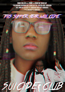
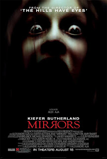
This is the third draft of my horror movie poster, right of the bat you can see that there were a lot of changes made in this draft from my second draft. When comparing my second draft to a comtemporary horror movie posters there seem to be a large amount of differences,


As you can see in the poster in the right, horror posters tend to be mostly covered in a dark shadow whilst the main focus of the posters seem to be highlighted in some sort of spotlight; this is something i had implemented into my own poster, I had also incorporated a lens flare into the knife that my main character is holding to make the lighting seem more authentic.
At the bottom of the poster I had incorporated the release date of the film as that is a major convention of movie posters. In addition to the release date of the movie I had also incorporated two indie film festival at the sides of the poster to increase the authenticity of the poster. I had also added the names of the actors staring in my film as it is a key convention that is used in all movie posters. Another new addition to my poster will the tagline I had included at the top of my poster this tagline will be used to persuade audiences to want to go to the cinema and watch the film as it states that the film was created by the same people who had created critically acclaimed horror films and thereby increasing the reliability of the film. Finally I had digitally incorporated blood unto the face of the main character of my narrative to further implement the theme of death in my narrative.


No comments:
Post a Comment