

Here is the third draft of my horror movie film magazine, I had decided to make the following changes to my magazine in order to make it look more like an authentic movie magazine, I had also included some horror motifs into my magazine front cover to further emphasize the genre of horror.
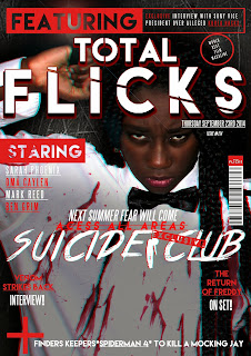
Changes I had made to my second magazine draft includes moving and placing the barcode of the magazine to a more conventional area, I had also added a red strip at the far right of the magazine to fill out some of the empty space present. I moved the date and issue of the magazine to under the feature bar because I believed that it was a much more conventional place as the original placement was blocking the main image. I order to further implement the motif of horror I had added two horror related taglines to the magazine, I had also used two horror fonts and the colour red.
No comments:
Post a Comment