Showing posts with label Implementation. Show all posts

Thursday, 26 February 2015

Horror magazine ver2.


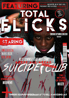
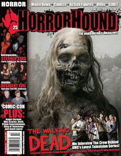
Here is the third draft of my horror movie film magazine, I had decided to make the following changes to my magazine in order to make it look more like an authentic movie magazine, I had also included some horror motifs into my magazine front cover to further emphasize the genre of horror. 


Changes I had made to my second magazine draft includes moving and placing the barcode of the magazine to a more conventional area, I had also added a red strip at the far right of the magazine to fill out some of the empty space present. I moved the date and issue of the magazine to under the feature bar because I believed that it was a much more conventional place as the original placement was blocking the main image. I order to further implement the motif of horror I had added two horror related taglines to the  magazine, I had also used two horror fonts and the colour red.

Horror poster ver2.


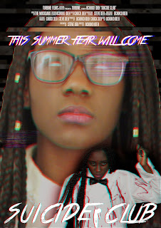
This is the third draft of my horror movie poster, right of the bat you can see that there were a lot of changes made in this draft from my second draft. When comparing my second draft to a comtemporary horror movie posters there seem to be a large amount of differences, 
 

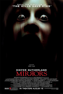
As you can see in the poster in the right, horror posters tend to be mostly covered in a dark shadow whilst the main focus of the posters seem to be highlighted in some sort of spotlight; this is something i had implemented into my own poster, I had also incorporated a lens flare into the knife that my main character is holding to make the lighting seem more authentic. 
At the bottom of the poster I had incorporated the release date of the film as that is a major convention of movie posters. In addition to the release date of the movie I had also incorporated two indie film festival at the sides of the poster to increase the authenticity of the poster. I had also added the names of the actors staring in my film as it is a key convention that is used in all movie posters. Another new addition to my poster will the tagline I had included at the top of my poster this tagline will be used to persuade audiences to want to go to the cinema and watch the film as it states that the film was created by the same people who had created critically acclaimed horror films and thereby increasing the reliability of the film. Finally I had digitally incorporated blood unto the face of the main character of my narrative to further implement the theme of death in my narrative.

Wednesday, 25 February 2015

Jump scare draft one

Here is the first draft of a jumpscare I planning on including in my horror teaser trailer, from some verbal feedback I have gathered that the jumpscare is not at all "scary" and it also does not seem to fit in with the themes present in my narrative.


To combat this piece of criticizing I will be researching into ways of making my jump scare more authentic and "scary", in addition to this I will also be reaching into ways I can incorporate my jumpscare into my narrative,

Demon face update

Here is the image I am going to use for my demon face section in my teaser, I originally wanted to record a sequence but couldn't find any tutorials online to guide me so I had to improvise.


It was extremely easy to achieve this demon face, all I had to do was mask around the face on Photoshop with a magnetic lasso and the use the curves adjustment layer to change the hue, saturation and contrast of the mask. 

Teaser Trailer update


As stated earlier in my blog the second draft of my teaser trailer is up, now I am working on my third draft this time I want to implement even more horror conventions into my teaser and whilst researching I came across a convention called scare/demon face; this is when the unsuspecting audience is shocked by a jump scare that normally involves a demon face and a scream such as the one pictured below.
 

I also came across a video on youtube with a chilling track I will like too feature in my trailer. This video also influenced me to implement the demon face convention into my teaser trailer. 


Video credits-ByOussamaLmoussaoui

I also found a cool video on youtube of a woman screaming for about 13 seconds, I am planning on using this as the scream sound effect when the demon face shows up.

Horror Magazine ver1.0

 
=

Horror Poster ver1


Here is the third draft of my movie poster, I have pretty much kept everything the same as my plan but with some minor changes like the RGB split that is featured in my main image.

Tuesday, 24 February 2015

Teaser update

A piece of feedback I had gained from the first draft of my teaser trailer was that the music did not seem to correlate with the themes and the genre of my trailer. Audiences recommend that I featured "more creepier" music and audio samples. To combat this I had searched youtube looking for free royalty music that i could feature in my teaser.


I had come across this 10 minute long track that someone had composed and posted on youtube, the inspiration from this track was from a video game titled SCP-087, I belive that this track had succesfully managed to capture the creepy tones of the video game and would be perfect as a background track of my teaser trailer for the same reason. Credit of this video goes to- Natureworld1986 

I had also came across this video by a youtuber named Nicole McClelland which as a research into certain horror sound effects, I will also be using this sound effects layered untop of the track above to giver a fuller more authentic fill to my teaser. Credit of this video goes to-Nicole McClelland 


Thursday, 19 February 2015

Extra Filming and teaser update

As part of the feedback of my teaser trailer first draft I was told that my trailer doesn't seem to carry a horror vibe but instead seems to carry a thriller vibe, to combat this I had done some extra research into the conventions of a horror film. From my research I had concluded that horror films seems to adopt a dark/dull colour tone in their scenes, this is done in order to compliment the dark themes of the film. After my research I had gone back to adobe premier pro to reflect on my work and I had noticed that my footage seems to carry a vibrant blue colour tone which contradicted the themes of death and suicide present in my narrative; to combat this I had turned down the saturation of all my footage to around 50% to dull out the blue tone. The change in saturation was very effective as it gave my trailer a much more grittier and darker tone.
 In addition to the tone of the teaser I had decided to film some extra footage that further explore the themes of body manipulation and suicidal thoughts, I had included some snapshots in a pintrest board, click the image below to view them. 

Tuesday, 10 February 2015

Ancillary Final Mockups

Here are the final draft for my ancillary task, I am featuring two movie posters because I am planning on using cross media convergence to promote my movie on different platforms, the first poster would be a regular movie poster that can be found in magazine articles or billboards whilst the second movie poster would be an animated digital iteration that could be found in webpages and advertisement in online browsers and mobile devices. I had decided to include the final draft I had created for a video game box art for my horror film, it was a last minute decision to scrap this idea as I do not believe that it would be used as a source of advertisement unlike the other ancillary drafts featured in this post.


This will the traditional movie poster that will be featured in billboards and magazines. 

This will be the magazine front cover.

This will be the digital iteration of the movie poster.

This was the final draft for my video game box art.

Sunday, 25 January 2015

Sequence one

Here is the first draft for my horror movie teaser trailer, from viewing it you can see the several motifs and cinema conventions that I had included in my teaser. The first noticeable motif will the the use of letterboxing, letterboxing is the technique of "transferring film shots into a widescreen aspect ration to standard-width video format while preserving the film's original aspect ratio"- Wikipedia, I had added a letterbox to my trailer to achieve a rich cinematic look. 
Like I had stated earlier in my blog I had began to use adobe after effects to create a film institution intro and some trailer intersections, just like the letterboxing these conventions were placed to increase the authenticity of my teaser trailer. 
Emphasizing on the themes of the darker side of technology I had included free stock footage of static to act as an transition between scenes in my teaser, I had also used adobe after effects to create some glitch effects and transitions to better fit the general tech theme of the teaser. 
The music that I am using in my teaser trailer is called Oh Death, this was a short track that was created for the US hit TV show Supernatural that was used to introduce the character of death into the shows continuity, I believe that this song is quite fitting for my teaser as the lyrics give an emphasis on death, a key theme that is heavily implied in my teaser trailer.

Sunday, 4 January 2015

Finding the right sound for my trailer

Now that I am in the post production portion of my project it is time to start searching for some resources to use when composing my trailer. The first on my list would be to find the right sound for my trailer. In order to add authenticity to my trailer I will be using sites such as freesound.org and YouTube to find sound effects.

Tuesday, 30 December 2014

Photo graphs

When planning a photoshoot it is very important to keep three key areas in mind; number one, your artistic vision; before you rush blindly into taking some photographs and calling it a day it is important to have a visualization of what you want your final product to look like, for me this was easy as I had already began venturing with the visual themes and aesthetics I want for my movie, this visual theme being a very relevant technological/internet theme. Branching off from the artistic vision another key area to keep in mind is you model/characters physicality; it is important to direct your model to move or act in a particular way to accurately portray the state of mind or story that your character would be telling  through their body language. Last but not least it is always vital that you have the correct equipment and or setting that you would need to fulfill your artistic vision and too aid your character physicality, this could range from anything such as having the correct props, costume, lighting and etc.

Follow Ochuko's board Photoshoot inspirations on Pinterest. 
Above is someone is a pintrest board that I made to give me inspiration for my first photoshoot, I initially wanted to search for some images that focused on the darkside of the web/technology but after a few minutes of exploring I had stumbled across quite a lot of horror themes photography that seemed to be pressing on out of body experiences, dual personalities and demonic possessions, although there are rarely touched upon in my initial narrative I was inspired by them and had decided to tweak my narrative just to incorporate this type of photography into my project, in addition to this, out of body experiences, dual personalities and demonic possession are all very popular horror motifs which would allow  my final product to look and feel more authentic. 
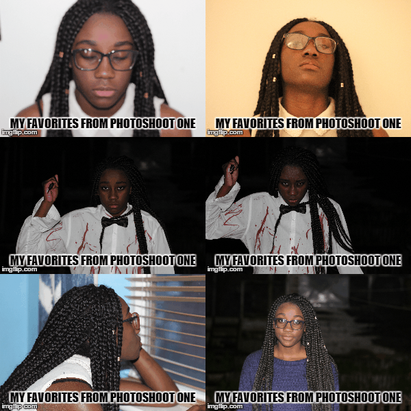
 
Above are some of my favorite photographs from my first photoshoot, I will start of by saying things did not go quite according to plan nevertheless this photographs still came out decent and nothing a little Photoshop can't fix ( haha XD). Let me start of by relating the outcomes to my key features. 

Artistic vision 

The type of vision I had for this photoshoot was to present my main character in two different physicals states, state one being the state of an everyday teenage girl and state two being the state of a psychopathic turned suicidal killer, I had also planned to have an extra state to showcase my character during her transition of physical states.  

Model/Character physicality 

This is something that I had heavily focused on during my photoshoot, I wanted my model to tell  a story through her body language and this is something that she certainly did. Take the psychopathic photographs for example I had directed her to stand in that particular way and too hold the knife in the particular way in order to evoke some semblance of fear into my audience.  

Equipment 

I had used a Cannon EOS 600d to capture my photographs, the same  
 had used to film my footage, in addition to this  had used the 50mm 1.8 lenses with the camera as the lenses is a much better fit for recording video and capturing images in low lighting than the default lenses that the camera comes equip with. using some leftover fake blood I had bought for filming my footage and an old white shirt I had fashioned together a DIY killers costume. 


Sunday, 7 December 2014

Day three of filming

Today I had re shot some of the night scenes I had filmed earlier but came out lest then desirable and I had also filmed the remaining night scenes in my schedule. I had shot all these scenes during the day time, this is because as stated before I do not have any sort of professional lighting to light up my actors when filming in low lighting so I decided to just film all my night scenes during the day and edit the clips to make them look like they were shot at night time in post production.


Saturday, 6 December 2014

Day two of filming

Today was the second day of film and luckily for me I ran into far less problems when filming. I had dedicated today to filming the scenes that took place in the daylight and used the natural sunlight as the lighting for my scenes. Although I did run into some issues of the ambient sounds of set being a bit louder than my actors but I can easily fix that in my editing software.


Sunday, 30 November 2014

Day one of filming

Today I began filming my teaser trailer. I had filmed some of the scenes that take place in the night schedule of the shooting order. I found it quite fun experimenting with the different shots and angles I could use to better accentuate the pacing of the scenes. I had used members of my family as actors in my scenes and had used my house as the location for the scenes, I had done this because I wanted to set my teaser in an everyday suburban house and thought my house was the right representation for this, using a suburban house allows me to make a link with my audience because they can relate with the lifestyles of my characters,
Due to the low ambient lighting in my house I had to compromise and use a combination of LED lights and mobile phone torch lights to lit the setting.


unfortunately whilst I was evaluating the clips that I shot I had discovered that the footage came out quite grainy/noisy whilst being quite dark, meaning that the lighting I had used was still inadequate, to combat this I would heavily edit the image on after effects and premiere pro to increase the brightness and decrease the noisiness of the clips. 
Altogether this was a great learning experience as I know what the problems I need to consider before I begin filming again.