Tuesday, 30 December 2014

Photo graphs

When planning a photoshoot it is very important to keep three key areas in mind; number one, your artistic vision; before you rush blindly into taking some photographs and calling it a day it is important to have a visualization of what you want your final product to look like, for me this was easy as I had already began venturing with the visual themes and aesthetics I want for my movie, this visual theme being a very relevant technological/internet theme. Branching off from the artistic vision another key area to keep in mind is you model/characters physicality; it is important to direct your model to move or act in a particular way to accurately portray the state of mind or story that your character would be telling  through their body language. Last but not least it is always vital that you have the correct equipment and or setting that you would need to fulfill your artistic vision and too aid your character physicality, this could range from anything such as having the correct props, costume, lighting and etc.

Follow Ochuko's board Photoshoot inspirations on Pinterest. 
Above is someone is a pintrest board that I made to give me inspiration for my first photoshoot, I initially wanted to search for some images that focused on the darkside of the web/technology but after a few minutes of exploring I had stumbled across quite a lot of horror themes photography that seemed to be pressing on out of body experiences, dual personalities and demonic possessions, although there are rarely touched upon in my initial narrative I was inspired by them and had decided to tweak my narrative just to incorporate this type of photography into my project, in addition to this, out of body experiences, dual personalities and demonic possession are all very popular horror motifs which would allow  my final product to look and feel more authentic. 
 
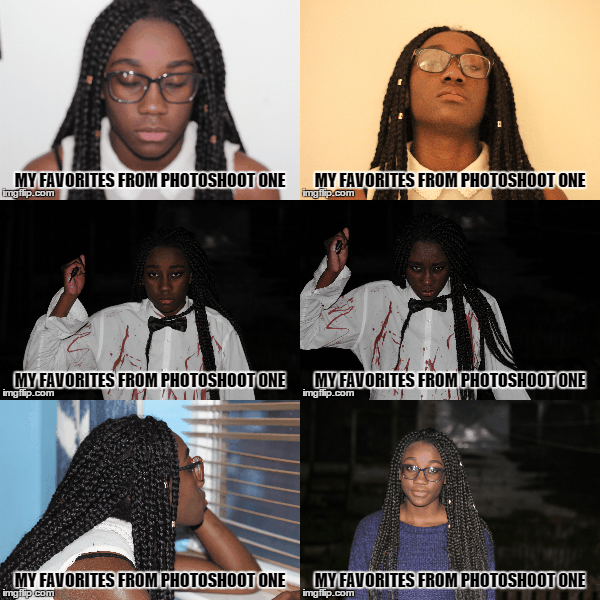
Above are some of my favorite photographs from my first photoshoot, I will start of by saying things did not go quite according to plan nevertheless this photographs still came out decent and nothing a little Photoshop can't fix ( haha XD). Let me start of by relating the outcomes to my key features. 

Artistic vision 

The type of vision I had for this photoshoot was to present my main character in two different physicals states, state one being the state of an everyday teenage girl and state two being the state of a psychopathic turned suicidal killer, I had also planned to have an extra state to showcase my character during her transition of physical states.  

Model/Character physicality 

This is something that I had heavily focused on during my photoshoot, I wanted my model to tell  a story through her body language and this is something that she certainly did. Take the psychopathic photographs for example I had directed her to stand in that particular way and too hold the knife in the particular way in order to evoke some semblance of fear into my audience.  

Equipment 

I had used a Cannon EOS 600d to capture my photographs, the same  
 had used to film my footage, in addition to this  had used the 50mm 1.8 lenses with the camera as the lenses is a much better fit for recording video and capturing images in low lighting than the default lenses that the camera comes equip with. using some leftover fake blood I had bought for filming my footage and an old white shirt I had fashioned together a DIY killers costume. 


Thursday, 18 December 2014

Poster Mockup


Introduction  


This is the first draft of my movie poster, this movie poster is reflective of the original movie Suicide club movie poster. I had decided to go with the same colour scheme of the original movie poster, this colour scheme is yellow and black, I added the splash of white/grey to add a little more dynamic to the colour scheme. I added the hashtag to the bottom right of the cover to draw the attention of  the viewers to the social network section of the movie posters.
 The masthead of the movie poster is slanted because I was applying the technique of the rule of Z into my movie poster. The rule of Z applies to this poster by directing The viewers attention firstly to the slanted masthead of my poster, audience attention is then directed to the reflection of the masthead to further staple the film tittle into their minds, this rule of z then directs the viewers attention to the social links at the bottom left of the poster; to allow the viewers get more information about the film, finally the rule of z directs the viewers attention to the hashtag at the bottom right of the screen.

Sunday, 7 December 2014

Day three of filming

Today I had re shot some of the night scenes I had filmed earlier but came out lest then desirable and I had also filmed the remaining night scenes in my schedule. I had shot all these scenes during the day time, this is because as stated before I do not have any sort of professional lighting to light up my actors when filming in low lighting so I decided to just film all my night scenes during the day and edit the clips to make them look like they were shot at night time in post production.


Saturday, 6 December 2014

Day two of filming

Today was the second day of film and luckily for me I ran into far less problems when filming. I had dedicated today to filming the scenes that took place in the daylight and used the natural sunlight as the lighting for my scenes. Although I did run into some issues of the ambient sounds of set being a bit louder than my actors but I can easily fix that in my editing software.


Thursday, 4 December 2014

Ancillary Task- understanding film magazines

Introduction

Film magazines or monthly or weekly prints that are published by several publishing house that are used to promote and or discus; film topics, release dates and trivia. Film magazines do not tend to often stray away from the conventional formulas that are present in any other type of magazine publication. The conventions of film magazines are pretty basic and these are; mastheads ( the title of the publication), cover line (the short statements often found near the masthead that are used to promo the content of the magazine and  to  tempt readers to purchase the issue) and puff (these are
the brightly coloured shapes that you can find poping out of the cover page, these work similarly to the coverline as they temp readers to wanting to buy the issue).


Masthead

Whilst researching into film magazines I had found that the must popular publications had catchy titles; the type of titles that just roll off the tongue, this is very vital for as it is a marketing startergy that gets the name of the magazine well branded into the public mind. Major examples of catchy titles range from "Total Film" to "Empire"; to further increase the authenticity of my ancillary task I had decided to duplicate this formula and slap it into my own magazine. Using "Total Films" as a stimulus I began to brainstorm ideas for magazines names by coupling a bunch of film terms together
such as "Motion" or "Flick" and had then settled on the name "Total Flicks".
 

With the title of my magazine chosen I had then began searching for the font I will like to use for my masthead; using dafonts.com I had came across five different fonts that caught my eye, I had then tested these fonts and took a pole in my media class for which font I should use. 


Sunday, 30 November 2014

Day one of filming

Today I began filming my teaser trailer. I had filmed some of the scenes that take place in the night schedule of the shooting order. I found it quite fun experimenting with the different shots and angles I could use to better accentuate the pacing of the scenes. I had used members of my family as actors in my scenes and had used my house as the location for the scenes, I had done this because I wanted to set my teaser in an everyday suburban house and thought my house was the right representation for this, using a suburban house allows me to make a link with my audience because they can relate with the lifestyles of my characters,
Due to the low ambient lighting in my house I had to compromise and use a combination of LED lights and mobile phone torch lights to lit the setting.


unfortunately whilst I was evaluating the clips that I shot I had discovered that the footage came out quite grainy/noisy whilst being quite dark, meaning that the lighting I had used was still inadequate, to combat this I would heavily edit the image on after effects and premiere pro to increase the brightness and decrease the noisiness of the clips. 
Altogether this was a great learning experience as I know what the problems I need to consider before I begin filming again.

Saturday, 29 November 2014

Storyboard and shooting order

Above is the storyboard for my horror teaser trailer, I am planning on having a dark and "techy" look on my footage; I can achieve this by using Adobe premier pro to change the colour grading of my footage so that it appears like an authentic Hollywood movie. I will also use Adobe After effects to generate and animate some glitch/computer error animations to implement into my teaser, these computer error animations will be effective at connoting the themes of technology in my trailer as well provoking an uneasy tension into my audience.

Thursday, 27 November 2014

Test teaser trailer


This is a short test teaser trailer that I had produced to sort of test and try out the different techniques I could use in  my final product. One of  the main techniques I was focusing on in this teaser trailer are dolly movements, I really wanted to give the teaser an authentic blockbuster feel so instead of having normal static/still shots in my sequences I decided to having moving shots. Moving shots make scenes for engaging for audiences and also emits a feeling that the scene is pacing faster than it actually is. When shooting these scenes I wanted to get as many shot types in as I possibly could the majority of the shots consisting of mid-shots, close ups and extreme close ups.
 In the first sequence of the teaser I had used a computer desk chair and a tripod to emulating the feeling of having a dolly to track my actor with, I found this quite difficult to do and I taken many takes because on like an actual dolly track the desk chair does not have a predetermine track to follow and would sometimes swerve out of focus when trying to convincingly follow my actor. The second sequence consisted of a pan movement that showcased the items on the table, this shot was much more easier to capture as all I did to motivate the shot was place my camera on cardboard and slide it along the flat surface of the table.
 The second dolly track movement I did was much easier to execute than the first one,  this is the part v of the trailer where my actor is using the laptop and the camera zooms in to show the audience what my said character is doing on the computer. To achieve the dolly shot all I did was use the desk chair and tripod again as I moved closer to my actor.
 Another initial part of the trailer as the lighting originally the only lighting I had was the ambient lighting that was emitting from the lamp in the scene but this turned out disastrous as the scene was lithely dimmed causing the footage to come out noisy and hard to view, to tackle this I had borrowed the industrial flood lighting from my schools drama department to properly light the scene but even with flood light the final footage still turned out less than desirable; to combat this problem I had done some research into the type of equipment that would solve my lighting problem and found that I was using the wrong lenses. The camera I was using was the Cannon 600D which came equip with an 18-55mm lenses, this lenses is known to let little light into the sensors thereby making it worthless when filming in low lighting area. I had then bough a Cannon 50mm 1.8 lenses which is one of the lenses suggested to me for filming in know lighting, the difference between the two lenses was amazing, the 50 mm lenses produces a much more professional and sharper looking image and would be the lenses I will use to film my final product.

Thursday, 20 November 2014

Test teaser storyboard


Before I big shooting and editing my final product I though it would be quite appropriate to get a film for the kind of work I will be producing. I had storyboared a short teaser trailer that would showcase some of the themes in my narrative and some of the techniques that I may use in my final teaser trailer.

Thursday, 13 November 2014

Adapting the themes to my teaser

When creating a film of any genre it is important to always set a particular theme/tone that will be apparent throughout the course of the entire film, my doing this content creators are injecting the motif and connotations of the film into the viewers sub consciousness to help them to fully grasp unto the narrative of the film and the major plot points. 
The themes present in the original Suicide club film consist of; fear, death/suicide, brainwashing and technology, as I am using the original film as influence for my own narrative I will need to implement the themes and motifs of the original source into my teaser trailer. I will be using technology as my major theme in my teaser trailer, by capitalizing on the themes of technology in my teaser trailer I will  be casting a very thorough reflection on the use of technology in our separate everyday lives, in turn I will be making my trailer reliability surpass those in my target demographic to everyday users of technology, I can achieve this my making the characters in my teaser trailer interact with technology one way or another; this could be done by showcasing my character getting a text message or showcasing my character visiting a certain website.  

Thursday, 6 November 2014

What is a teaser trailer


A teaser trailer plays a major role in the marketing side of the film industry as it allows a film/content creator to slightly "tease"/temp any movie goer to viewing the movie.
 The conventions of a teaser trailer are kept pretty simply, with the duration of the teaser trailer being a major practicality of of the conventions, film makers tend to produce a teaser trailer that varies between 60 seconds to 120 seconds in duration. The short duration of the teaser trailer is then used as an essential mechanisms when attract the right demographic as the viewers of the trailer would in turn be persuaded to wanting to watch the full feature length film.
 When creating a teaser trailer it is important the the content creator showcases the right amount of narrative and plot twist in the trailer, if the content creator was to showcase a small amount the attention of the demographic would barely be light thereby causing audiences to not be interested  to watch the film, in addition to this if the content creator was to showcase to  much of the narrative in the teaser audiences may believe that they would not need to watch the film because they believe that they already know the story line and wouldn't want to spend money to watch the actual film. If the content creator was to showcase just the right about to make the teaser ambiguous but still quite captivating to make audiences interested on watch the actual film then the content creator has achieved his goal of creating a successful teaser trailer. I am planning on using this technique of my teaser trailer to thereby increase the authenticity of my product.
Above is a teaser trailer for an up and coming horror movie to reach the cinemas. As we can see the teaser is only 137 seconds long which is close to the 120 seconds rule I had mentioned earlier in this post. From this 137 second long trailer we that audience are introduced to some of the themes are and narrative of the film, from the teaser we are introduced to enough of the narrative that we know the basic outline of the narrative whilst the teaser is still ambiguous as we are not informed of the events that lead up to the graphic scenes that are showcased near the end of the teaser.
 We can see that Todorov's theory on narrative has been applied to this trailer this is evident due to the beginning of the teaser portraying the equilibrium; the part of the narrative where the characters are living out their normal lives unaware of any of the danger they are about to face this is highlighted between the 0:00-0:29 of the teaser were we see our to main characters enjoying each others company whilst a peaceful backing track is played in the background to connote the sense of stability. This stability is disrupted at 0:46 were the disruption appears the characters are put in unrest by this disruptions and are now aware that they might be in danger, but that is as far as Todorov's theory of narrative is applied to this teaser; then rest of the teaser showcases different points of the disruption section in the film, this was done by the content creator as a way to ease the audience to watching the film in cinemas, as the ambiguity of the characters fate will then captivate the audience to sit through the entire film. As I had mentioned before this technique plays a major role in the marketing side of film making and would be the technique that I am applying to my teaser.

Friday, 24 October 2014

Suicide club

Introduction
Suicide Club otherwise known as Suicide Circle in Japan is a Japanese horror/thriller film directed by Japanese director Sion Sono and was released October 29 , 2001. Unlike other critically acclaimed Japanese horror film, this film did not receive a western transitional film adaptation; which is what influenced me to use this film as an influence for the narrative of my horror teaser trailer.
 I am planning on replicating the successful conventions that were placed in place by other directors that had transitioned Japanese horror film into western horror blockbusters.

Plot

The story takes place in Tokoyo, Japan in the course of six days. The story follows a band of detectives as they are tasked with uncovering the case of the mass suicides that keep occurring all over Japan. The first case of suicide occurs when a massive group of school girls jump in front of a speeding train and thus taking their lives, this causes mass hysteria as more and more suicides are being committed. During the course of the story the detectives were tipped about a website that displays red and white circles that signifies the amount of male and females that had committed suicides in the past few days. At the end of the film the detectives discover that the cause of the mass suicides were the doings of a Japanese pop group called Deserts who's music had drawn people to commit suicide.

My interpretation 
In order to avoid plagiarism I have been advised by my teacher to use the narrative of the movie as influence for my own narrative as I am not allowed to replicate or mimic any of the original source. As I am using the original narrative as influence for my own narrative I will focus on some of the key themes in the original source to use as a  stimuli. I have decided to keep the theme of mass suicide as a major plot point in my narrative. I want to set my narrative in modern day London and thus I will research into the conventions I must use to make the regional location of my narrative known.
Instead of using a Japanese pop group as my main antagonist I will be enforcing a practical and western stereotypical uncanny antagonist as my antagonist establishes that I have successfully translated the film from eastern to western as most western horrors follow the conventions of having a uncanny/paranormal antagonist in their horrors.

Thursday, 16 October 2014

One shot perspective


One shot perspective is a visual technique that was popularized by acclaimed director Stanley Kubrick. This techniques refers to the center of the attention being in the middle of a grid. This type of technique has been acclaimed by many critics praising it stating that the one shot perspective is visually pleasing to the eye.

In the image above we can see an example of Kubrick's famous one shot perspective from the movie 2001: A space odyssey, from this image without knowing what the one shot perspective is it is obvious what the main focus of the image is the man in the middle, this is simply because our brains recognise that the subject is the most important part of the image straight away simply because it is placed in the middle. Many believe that this practice contradicts with the rule of Z; this can be disproved because the rule of Z is used whenever the content creator is trying to draw the attention of the viewer to the different subjects on the screen periodically whilst the one shot perspective is generally used when the surrounding objects are smaller than the main subject in the shot thereby making the viewer pay attention the subject first.

Rules of Thirds and Rule of Z

Introduction
The rules of thirds refers to a technique that is used mostly by photographers to establish and separate the center of attention from the surrounding objects, this technique as also been adapted by content creators as a technique that they go by to create an eye fulfilling shot were everything that is present of the shot.
   The technique is titled the rule of thirds because the guideline consist of a three by three grind with each grid being equal in size.
When using the rules of thirds it is important to strategically place each subject and its surroundings in a particular grid in the guide line. In the example above the exist to road is placed in the furthest right of the middle row of the gridline. It is evident that the photographer had placed it there to connote that it is not the subject of the picture, the  subject of the image being placed in the middle grid thereby attracting the viewers attentions first. To contradict this there is another technique called the rule of Z; this technique is quite similar to the rule of thirds as they both use the same grid guide line. The rules of Z is called this because it states that the attention of the viewer of the picture will firstly directed to the upper left grid of the image followed by the attention being directed to the upper right section of the image and then the center grid of the image, this then continues by the attention of the viewer being directed to the lower left section of the grid and finally the attention is directed to the lower right section of the grid. After following the rule of Z the viewers attention will then be directed to the section of the image that they had not viewed; these sections being the middle left and middle right section of the of the guideline.

Tuesday, 14 October 2014

Todorov narrative theory

 Introduction


Tzvetan Todorov is a Bulgarian-French philosopher who had lived in France since 1963 during his life span he had written a lot of essays and books detailed several theories of his. One of his most influential theory was his narrative theory. Todorovs narrative theory details the different sections of a given narrative in the films and multimedia content of today. Todorovs theory transcends past whether a film as a clear "beginning", "middle" and "end" but rather states a film consist of an "equilibrium", "a disruption", "realization", "restored order" and "equilibrium again".

Equilibrium

Equilibrium refers to stability, this is the beginning of the film, this is the part of the film where the characters are going around living their every day lives unaware of the events that are about to unfold before them. Content creators achieve a state of equilibrium by incorporating a lot of content that the audience at home are familiar with and can relate with into the scene, a fine example of this could be a middle aged woman returning home from work only to head off and pick her children from their primary school or a teenager having am argument with their parents. The content creator knows that these are part of the everyday scenery of an average person their by making the scene canny to the audience allowing them to make a mental link that this part of the story is the "normal/average" part or better yet the equilibrium.

Disruption and Realisation

Disruption refers to the part of the film that is uncanny to both the audience and the characters that exist in this diegesis world. This part of the film signifies the beginning of the adventure or even the beginning of the unrest as it "rips" the characters out of their everyday lives and violently tosses them into a "realm" of uncanniness, the audience is then also disrupted by this sections are they had already made a mental realisation that the events that occurred during the equilibrium of the film also transpire during their everyday lives but know are faced with an unsettling sense of uncanniness but cannot do anything but watch the events unfold before them through the eyes of the characters, because the audience had already made these links with characters their can project themselves onto the characters as they embarked on during the film.

Restored order

Restored order refers to the part of the film where the characters attempt to repair the disruption that had occurred earlier during the film. It is at this point that the audience see the characters begin to develop. The content creators used this point at the film to showcase the characters emotions are their different responses to each stimuli this allows the audience to further strengthen the link that they had made to the character most similar to them, as the audience once again make a canny link to the ways in which each character handles the position that they are in. Restored order is very crucial to the narrative of the film as not only does it showcase character development but it also ties each individual uncanny plot hole together thereby making the viewing experience canny for the audience again.

Return to equilibrium

Return to equilibrium refers to the "general" ending off the film as everything returns to "normal" and a state of canny that the audience is familiar with. This allows the audience of the film to evaluate the personal journey that they had taken during the film my projecting themselves into a canny character. The return to equilibrium also signifies the return to a state of stability and for the most part a happy ending.

Sunday, 12 October 2014

Sound and music developed

In addition the diegetic and non-diegetic sounds there are also a vast array of other sub-conventions that the content creator may use to fully enrich their multimedia piece. like I have stated before many of these conventions are put together in the post-production process but some of these conventions are engaged during the production process such as conventions like soundscaping, ambient sounds and ambient lighting.

Volume control

Volume control is am effect used by the content creators during the post productions process to emphasis the tone and emotions that have already been set in the scene by the diegetic and non-diegetic elements present in the scene. Volume control usually parallels with the pace of the scene.

Example of volume control


In this clip we can see a fight scene between the protagonist and antagonist of the narrative. The volume control is used most effectively in the sections of the fight scene when the protagonist is the danger, the first instance is when the fight begins; as the volume and the tempo of the fight scene is greatly increased to let the audience know that a fight is about to transpire. Volume control is the further used multiple times across the scene whenever the antagonist gains the upper hand during the fight as the rise in volume control will influence the rise in the audience anxiety. The most successful use of volume control is at the very end of the clip as the antagonist had won the fight this sparked the decrease in the volume and tempo of the clip and signifies the "all is lost" moment to the audience.

Dialogue

Dialogue is any speech or spoken language that is given in the multimedia piece and is really self explanatory. When using dialogue the content creator has to consider three major aspects. These aspects are language, tone and accent. The use of language refers to the words that are spoken by the characters and the connotations of these words, language is used by the content creator as the main story telling contributor of the multimedia piece. Tone refers to the way that the character delivers that dialogue that they are saying, giving the tone of the scene that the content creator is trying to achieve that character can deliver the dialogue in parallel to the tone that has already been established by the content creator, for example the is an aggressive tone as been establish the by the use of the diegesis and non diegetic elements the actor will have to deliver the dialogue in an aggressive tone. Accents are used to allow the audience establish the origins of the characters, there really not that much to it, from the accent exhibited by the character the audience can establish the regional identity of the character and thereby make a further judgement on their possibly upbringing and lifestyle.


Thursday, 9 October 2014

Sound and Music

Introduction

When creating a piece of narrative sound and music are very useful conventions that could be used to set the theme and strengthen the motif of the piece. there are different sub-conventions of sound and music that can be applied to a multimedia piece, with a combination of editing and clever planing the director of the piece can create the pseudo world that they can immerse the audience into.
     Just like editing sound is part of the post-production process. The different types of sub-conventions are then placed to emphasis the emotions or the reality that the director had envisioned.

The Diegesis world

The diegesis world is a the reality that in which the TV programs, film and music videos takes place; this world inhabits the subjects of the media and is also made up the dietetic elements. Diegetic elements refers to the subjects in the diegetic world that the characters are aware of; this consist of natural sounds such as raindrops and car horns otherwise known as ambient sound. The use of these diegetic elements are used to fully immerse the audience into the diegesis world. The opposite of diegetic elements are known as non-diegetic elements, non-diegetic elements are elements of the media such as music and noises that the characters are not aware of this is simply because the non-diegetic elements do not exist in the diegesis world. The non-diegetic elements are used by the content creator the aid the audience interpret the tone and mood of the scene. popular examples of non-diegetic sounds are voice overs or background music.

 Example of diegetic sound


In this clip we can see that the character is aware of the music used in the clip, as when the song begins he makes an eyeline match the the source of the music, this allows better immersion for the audience as the fact that they can hear the same music that the character can then makes a link between the audience and the characters diegesis world.

Example of non-diegetic sound

This clip showcases a man shoveling snow as it is accompanied by a jolly Christmas carol. because the clip is only showcasing the lower half of the mans body the audience is unclear on what emotions the man may have but because the Christmas carol is quite upbeat the audience is left to interpret that the non-diegetic music is highlighting the mans emotions. The non- diegetic music can also be used to to set the scene because the music is a Christmas carol the audience can also interpret that the clip takes place in December somewhere around Christmas.

Tuesday, 7 October 2014

Ancinary Task


Introduction

Like I have stated before in addition to producing a teaser trailer I am also tasked with an ancinary task that comes hand in hand with my teaser trailer. The ancinary task sates that I must create a corresponding movie trailer and movie magazine showcasing the movie. Since the ancinary task bears a lot of similarity to the coursework I had produced last year I believe this give me an advantage when researching and producing the final product.

Movie Posters

Movie posters are a popular means of  advertisement, we see them everywhere. We can spot movie posters displayed in cinemas, billboards, magazines, on the internet and even on buses. The primary goal of movie posters and or any other medium of advertisement is to "sell" the movie and persuade the targeted demographic to watching the film. Common conventions of successful movie posters include; a masthead in big, bold and eye catching font; Images of the movies main cast; details of the film such as its release date and the names of the cast; the certain design style of the movie e.g. the colour and fonts. All of these conventions can also be used to effectively reflect the tone of the film.
By analyzing movie posters I can gain more knowledge on how to effectively grab the attention of the audience without giving away the plot of the movie.

Movie Magazines

Similar to movie posters film magazines can be used as a very effective technique for promoting movies and other media services. This type of promotion/advertising is called below the line marketing this is when a movie magazine or any other type of publishing house pay you to feature your content in their magazine, for example a publishing house may pay you to part take in an exclusive interview to feature in their magazine, which in turn will boost their sells when compared to competing magazines. Similar to below the line marketing there  is also above the line marketing in which you pay a publishing house to feature your content in their publication, magazine adds being a fine example of this.

Cross Media Convergence and Synergy

In addition to movie posters and and movie magazine big conglomerates and indie films also promote their films through cross media convergence and synergy. Cross media convergence is the term used to describe the way that different products are produced and distributed in a majority of different platforms, cross media convergence can also be applied when marketing, for example a film company can use different platforms such as; TV's, YouTube, apps and print to promote their films.
Synergy on the other hand is when two or more institution come together either vertically or horizontally to achieve an objective that could not have been achieved independently. Synergy can also be used as a marketing strategy whereby a film company can team up with a game developer to producing a video game or an app that in turn will hype and promote the film to the gaming demographic a demographic that they may have not been able to appeal to when left to their own devices.

Saturday, 4 October 2014

My Influences

I have created this mood board to act as the visual stimuli I would need when fleshing out the narrative and conventions for my teaser trailer. In addition to my mood board I find that researching on youtube can be very usually when fishing for influences for my teaser trailer. The mood board contains still images from iconic horror films most of these still images also denote iconic scenes from their respective horror movie.
Like I had stated earlier in my blog I am interested in using Japanese horror films as some sort of stimuli for my teaser trailer much like America does when remaking the Japanese horrors. In addition to J horrors I am also open on using true horror stories as a stimuli for the narrative for my teaser trailer, this is very popular with a lot of horror films such as classics like The exorcist too recent films such as The conjuring and Annabelle.

Wednesday, 1 October 2014

Japanese horror films

Japanese horror films 

  
Like I have stated in my blog in recent years there have been many re-imaginings of popular Japanese horror films. Ringu was one of the first and also most successful to be remade in America as The Ring, and later The Ring Two although the sequel bears little to no similarities to the original that it was based on. Unfortunately American remakes of these classic Japanese films do not receive the critical and commercial success as their Japanese counterparts as The Ring is the only remake to not receive negative reviews with One Missed Call an American remake of a popular Japanese horror of the same name has received the worst reception of them all. 

Sunday, 28 September 2014

Male Gaze Theory

Introduction 

In an earlier blog post I had posted a deep analysis of the audience feedback I had received from my questionnaire in my focus group. Overall the audience feedback was quite insightful as it had helped me develop my understanding of my chosen demographic. One of the questions I had featured in my questionnaire was "Would you prefer a female or male protagonist?" like I had stated before thee feedback I had received from this question was more female centric as five out of six of my participants stating that they would prefer a a female protagonist over a male protagonist whilst the remaining one participant had stated that they would prefer to have both a male and female protagonist in a horror film.I had also stated that the majority of my male participant wanted a female protagonist because of the Male gaze theory.

What is the Male gaze theory 

The male gaze theory was a theory mentioned in the controversial essay "Visual Pleasure and Narrative cinema" by Laura Mulvey who strongly argued that when viewing a piece of media the audience is placed in the perspective of a heterosexual male, this is highlighted in the strong sexualisastion of females that are very common in modern music videos and films. The conventions of the male gaze theory goes as follows; scenes that focus souly of the curves and features of the female body, slow motion., deliberate sexual camera movements and cut aways.
    According to the male gaze theory female is usually seen through two different perspectives, the first being an erotic reward for the dominate male characters in the narrative whist the latter being seen as an erotic object for the spectator/viewer watching the film.
Mulvey's theory also states that the female gaze theory is more passive than the male gave theory further underlying unequal power symmetry between genders. Mulvey's essay also states that the male gaze theory applies to female themselves as they view themselves through the eyes of men.

The inclusion of a female in mainstream film/media is quite vital as the female characters tend not to have any real importance herself, but is rather the way she makes her male counterpart feel and act that is important, this mean that the female only exist in relation to the male protagonist.
The male gaze theory states that the gender roles of males in the media text are active whilst the female counterparts are seen as passive who in turn often slow the narrative down and act as sexual influence for the active roles, they are under control of the males gaze and are only there for viewing pleasure whilst the males in other hand push the narrative forward.
      The male gaze theory holds a majority of similarities to the ideology of voyeurism. Then term voyeurism comes from the French word voyeur which translates to "one who looks"; voyeurism is the sexual interest in or spying of someone in intimate scenarios. One key characteristic of voyeurism is that the voyeur does not practically have any direct interaction with the subject of his/her interest.

Tuesday, 23 September 2014

Focus group Data analysis

In addition to asking my focus group open questions using popwerpoint, I had also given them each a questionnaire that I wanted them to fill out. The questionnaire I had given my participants simply just expanded on the questions I had asked them during my powerpoint, in addition to expanding on my powerpoint I had also featured new questions which i was planing on using as research to begin to flesh out my narrative of my teaser trailer as well as understanding which features and conventions that my audience response to the best.

From my questionnaire I had gained more insight on my audience than I had from the focus group powerpoint is self, I am planning on using the information I had gained to further convey more coursework to the level of authentic and professional horror film trailers.

Transcript 
In my focus group I had featured an equal amount of each gender.  I had chosen three girls and three boys to participate, I did this because I wanted to appeal to a mutual demographic and wanted both genders opinions on each of my stimuli I found that boys frequently gave short and quick responses to my stimuli whilst girls gave more developed responses, this could connote that the female half of my demographic will be harder to carter to.


What is your age group?
Bellow 15
0
15-16
1
17-18
2
19-20
2
21-22
0
23-24
0
25
1
Above 25
0

For my focus group I had got a wide range of people of all ages, must of the females in my focus group tended younger whilst must of my males tended to be older, in total I had one 16 year old, one 17 year old, one 18 year old, two 19 year olds and one 25 year old.
            I believe that having the wide age range in my focus group in will help me relate more to the members of my audience of different ages. 


What is your favourite sub-genre?
Action horror
1
Body horror
0
Comedy horror
4
Gothic horror
0
Natural horror
1
Psychological horror
2
Sci-fi horror
2
Slasher films
1
Splatter films
1
Zombie films
2

The majority of the responses from my focus group had stated that their favourite sub horror genre, I could reflect this piece of research into my final product by making my horror trailer a comedy horror. Due to my lack of knowledge on the comedy horror genre I will need to do intensive reteach into the conventions of the genre to properly carter to my audience.
            Drawn in second place for my focus group favourite genre is Psychological horror, Sci-fi and Zombie horror and closely followed by Action horror, Natural horror, Slasher films and Splatter films. 

For my question 4 I had asked my focus group why they enjoyed each of their favourite sub-genres. The general response I gained stemmed from people explaining why their enjoyed the comedy sub-horror the best. One of the responses I got for question four was “Because it is funny & it makes the film less scary” most of my responses went along the lines of this.

Question 5 was quite an open question; I had featured this question in my questionnaire to use as a stimulus for the narrative of my teaser trailer. The responses I had gained from my focus groups were more along the lines of my participants stating the jump scares were the scariest part of the trailer closely followed by the ending. I can apply this knowledge to my coursework by being sure to use conventions in my final teaser trailer, I also believe that this will greatly increase the authenticity of my coursework because it greatly reflects the conventions that are apparent in blockbuster teaser trailers.

To help further flesh out the narrative of my teaser trailer I had asked my focus group participant whether they preferred horror films with male or female protagonist. The results I got from this particular question was certainly more female centric as 5 out of my 6 participants stated they would prefer a female protagonist whilst the reaming participant stated he would prefer both a female and male protagonist for my teaser. To reinforce this convention into my final teaser trailer I would need to briefly research into the horror films that include a female protagonist and the different conventions that come hand in hand with having a female protagonist.

In question 6 I had asked my focus group why they chose their particular answer for question 6, the female majority of my focus group had stated that they preferred a female protagonist because they find that the hero is more relatable that way and the narrative is also more “suspenseful”, whist my male majority had just stated that having a female protagonist is the “norm”. The general reaction of my male participants could be credited to the male gaze theory; theory that states all media outlets created to be seen through a heterosexual male eyes.


For question to I had asked my participants another question to help me further flesh out my narrative. The response I had gained from this question was just generic horror movies settings; to list a few there was haunted houses, graveyards and hospitals. There is not much to analyse from this question apart from the fact that it helps me when I’m looking for filming locations.

Tuesday, 16 September 2014

Focus Group transcript

Below is the transcript for my first focus group. 

Focus group consent letter

Here is the letter of consent that I will provide to the participants of my focus group before the session begins. 


Focus group Questionnaire

Here is the Questionnaire that I will provide to the participants of my focus group before the session begins 

Focus group powerpoint

  
       Here is the presentation that I will be using to prompt the Q and A section for my focus group 

Thursday, 11 September 2014

Target audience

When creating my visual piece I will need to fully understand and demonstrate the importance of target audiences and how I may research certain traits of my demographic in order to properly carter the conventions of my visual piece to their interests. To further develop my desirable narrative for my target audience I would need to research into the type of sub horror genre that they enjoy/fear the most and also research into other strands that could possibly affect the outcome of my narrative such as; whether my audience would prefer a male or female lead as well as what time era would they want my narrative to be set and etc. in addition to this I could also be able apply my demographic research into the representations of certain aspects and connotations of my horror trailer, for example; using my research I could determine how my demographic would like my protagonist to be represented, how my antagonist should be represented and most importantly how the mise en scene of my story to be represented.
  

Overall the general demographic for my horror film teaser trailer will be mostly teenage males aged between 15-25 who enjoy gore but will also settle for a more narrative based horror film than violence that they could perhaps enjoy with their significant others due to the fact that females do
also fall into my target audience.
A large majority of my target audience will come from homes that are working class and above this is because this outlet of entertainment and relief will be affordable for them since they come from a family of some sort of wealthy income.

Wednesday, 10 September 2014

Market Research


Here is a mood video that I made depicting the interest of my chosen demographic. 

Introduction
When tasked with creating a multimedia piece that can carter to a particular audience, it is very important to properly research into you're market audience. Researching into the brands, trends, music and etc that you're audience is into is equally as important as researching what type of content that you can include in your project in order to address you're particular demographic.
But before I start researching my audience I will need to to identify my audience, as I have said before I will need to understand the trends, brands and interest that I believe the demographic of my product will be interested in. I have included a list of said brands and trends below.

Demographic Identifier list
Causal movie goers
Soundcloud
YouTube
Partying
Instagram
Family Guy
South Park
American Dad
First Person Shooter Games
Zombie Themed video games
Horror Themed video games
Cheap Thrills
Theme Parks
Fright Nights
Game shows
Extreme Sports
Night life
Crime Documentaries
Dark humor
Skateboarding/ BMX/ cycling
Gym