Tuesday, 30 December 2014

Photo graphs

When planning a photoshoot it is very important to keep three key areas in mind; number one, your artistic vision; before you rush blindly into taking some photographs and calling it a day it is important to have a visualization of what you want your final product to look like, for me this was easy as I had already began venturing with the visual themes and aesthetics I want for my movie, this visual theme being a very relevant technological/internet theme. Branching off from the artistic vision another key area to keep in mind is you model/characters physicality; it is important to direct your model to move or act in a particular way to accurately portray the state of mind or story that your character would be telling  through their body language. Last but not least it is always vital that you have the correct equipment and or setting that you would need to fulfill your artistic vision and too aid your character physicality, this could range from anything such as having the correct props, costume, lighting and etc.

Follow Ochuko's board Photoshoot inspirations on Pinterest. 
Above is someone is a pintrest board that I made to give me inspiration for my first photoshoot, I initially wanted to search for some images that focused on the darkside of the web/technology but after a few minutes of exploring I had stumbled across quite a lot of horror themes photography that seemed to be pressing on out of body experiences, dual personalities and demonic possessions, although there are rarely touched upon in my initial narrative I was inspired by them and had decided to tweak my narrative just to incorporate this type of photography into my project, in addition to this, out of body experiences, dual personalities and demonic possession are all very popular horror motifs which would allow  my final product to look and feel more authentic. 
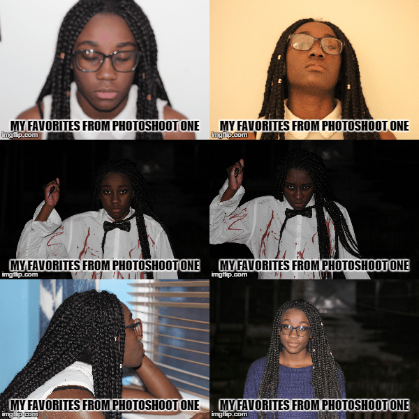
 
Above are some of my favorite photographs from my first photoshoot, I will start of by saying things did not go quite according to plan nevertheless this photographs still came out decent and nothing a little Photoshop can't fix ( haha XD). Let me start of by relating the outcomes to my key features. 

Artistic vision 

The type of vision I had for this photoshoot was to present my main character in two different physicals states, state one being the state of an everyday teenage girl and state two being the state of a psychopathic turned suicidal killer, I had also planned to have an extra state to showcase my character during her transition of physical states.  

Model/Character physicality 

This is something that I had heavily focused on during my photoshoot, I wanted my model to tell  a story through her body language and this is something that she certainly did. Take the psychopathic photographs for example I had directed her to stand in that particular way and too hold the knife in the particular way in order to evoke some semblance of fear into my audience.  

Equipment 

I had used a Cannon EOS 600d to capture my photographs, the same  
 had used to film my footage, in addition to this  had used the 50mm 1.8 lenses with the camera as the lenses is a much better fit for recording video and capturing images in low lighting than the default lenses that the camera comes equip with. using some leftover fake blood I had bought for filming my footage and an old white shirt I had fashioned together a DIY killers costume. 


Thursday, 18 December 2014

Poster Mockup


Introduction  


This is the first draft of my movie poster, this movie poster is reflective of the original movie Suicide club movie poster. I had decided to go with the same colour scheme of the original movie poster, this colour scheme is yellow and black, I added the splash of white/grey to add a little more dynamic to the colour scheme. I added the hashtag to the bottom right of the cover to draw the attention of  the viewers to the social network section of the movie posters.
 The masthead of the movie poster is slanted because I was applying the technique of the rule of Z into my movie poster. The rule of Z applies to this poster by directing The viewers attention firstly to the slanted masthead of my poster, audience attention is then directed to the reflection of the masthead to further staple the film tittle into their minds, this rule of z then directs the viewers attention to the social links at the bottom left of the poster; to allow the viewers get more information about the film, finally the rule of z directs the viewers attention to the hashtag at the bottom right of the screen.

Sunday, 7 December 2014

Day three of filming

Today I had re shot some of the night scenes I had filmed earlier but came out lest then desirable and I had also filmed the remaining night scenes in my schedule. I had shot all these scenes during the day time, this is because as stated before I do not have any sort of professional lighting to light up my actors when filming in low lighting so I decided to just film all my night scenes during the day and edit the clips to make them look like they were shot at night time in post production.


Saturday, 6 December 2014

Day two of filming

Today was the second day of film and luckily for me I ran into far less problems when filming. I had dedicated today to filming the scenes that took place in the daylight and used the natural sunlight as the lighting for my scenes. Although I did run into some issues of the ambient sounds of set being a bit louder than my actors but I can easily fix that in my editing software.


Thursday, 4 December 2014

Ancillary Task- understanding film magazines

Introduction

Film magazines or monthly or weekly prints that are published by several publishing house that are used to promote and or discus; film topics, release dates and trivia. Film magazines do not tend to often stray away from the conventional formulas that are present in any other type of magazine publication. The conventions of film magazines are pretty basic and these are; mastheads ( the title of the publication), cover line (the short statements often found near the masthead that are used to promo the content of the magazine and  to  tempt readers to purchase the issue) and puff (these are
the brightly coloured shapes that you can find poping out of the cover page, these work similarly to the coverline as they temp readers to wanting to buy the issue).


Masthead

Whilst researching into film magazines I had found that the must popular publications had catchy titles; the type of titles that just roll off the tongue, this is very vital for as it is a marketing startergy that gets the name of the magazine well branded into the public mind. Major examples of catchy titles range from "Total Film" to "Empire"; to further increase the authenticity of my ancillary task I had decided to duplicate this formula and slap it into my own magazine. Using "Total Films" as a stimulus I began to brainstorm ideas for magazines names by coupling a bunch of film terms together
such as "Motion" or "Flick" and had then settled on the name "Total Flicks".
 

With the title of my magazine chosen I had then began searching for the font I will like to use for my masthead; using dafonts.com I had came across five different fonts that caught my eye, I had then tested these fonts and took a pole in my media class for which font I should use.